
Seletor de cores
Colors can be selected by using two methods: The color toolbar and the color picker overlay.
To update the color palette, read the pack documentation.
The Pen, Shape, and Polygon tools also offer solid, gradient, image, and SVG paint for strokes and fills. See Paints for when to use each type and how its controls work.
Barra de cores
Seção intitulada “Barra de cores”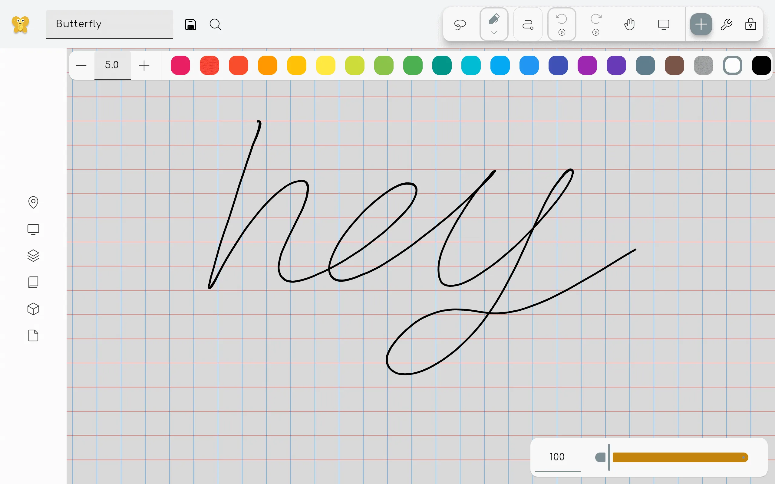
If this is enabled in the settings, a color toolbar will be shown when a colorable tool is selected. This toolbar allows you to quickly select a color from a predefined set of colors. Click on the plus icon to select a custom color.
Color picker overlay
Seção intitulada “Color picker overlay”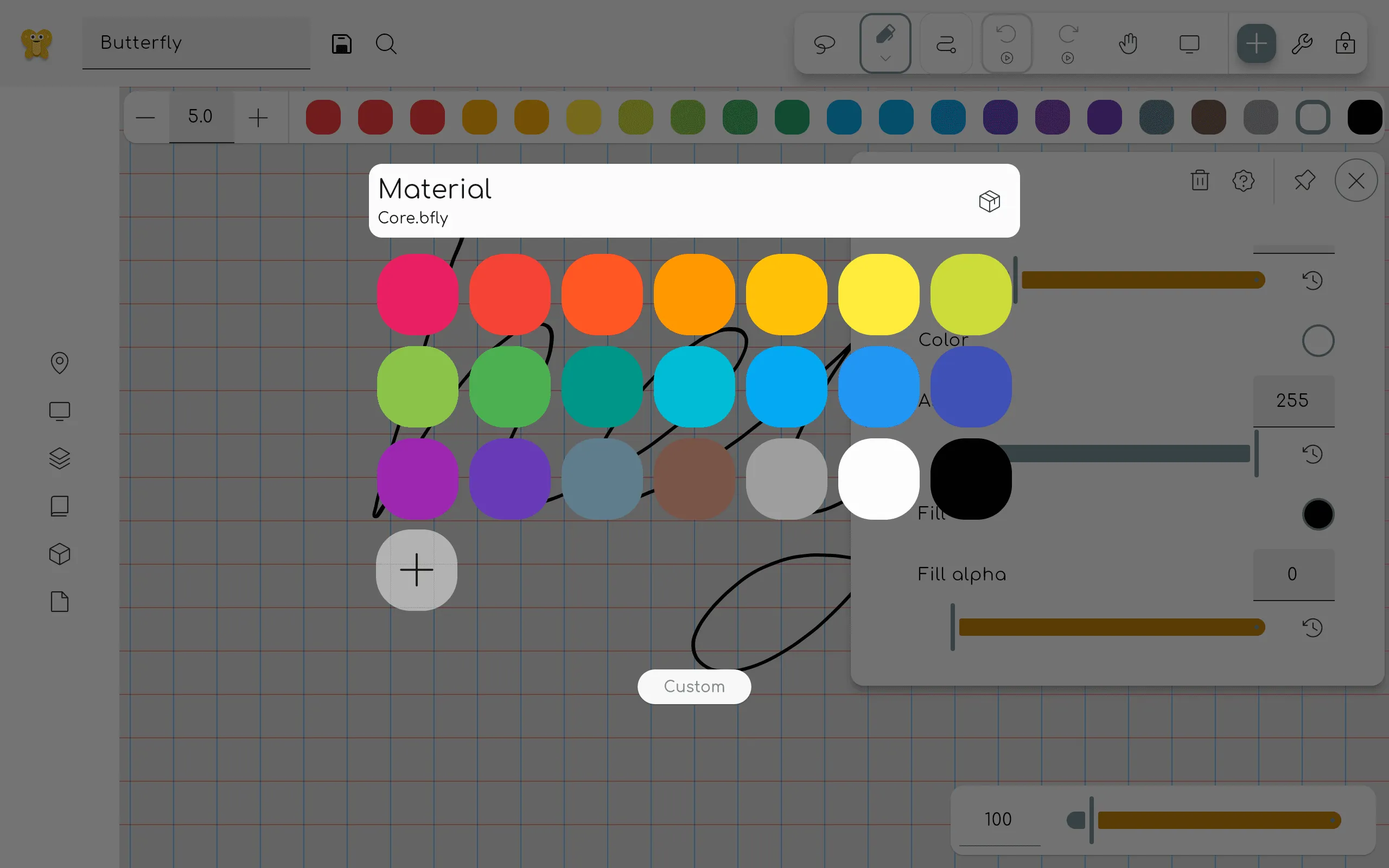
This overlay can be opened by clicking on a property tile that is colorable, for example inside the properties panel of the pen tool. Click on a color to select it. Click on the custom button to open the custom color picker.
If you want to delete a color from the palette, right click on it (or long press on touch devices) and select delete.
Custom color picker
Seção intitulada “Custom color picker”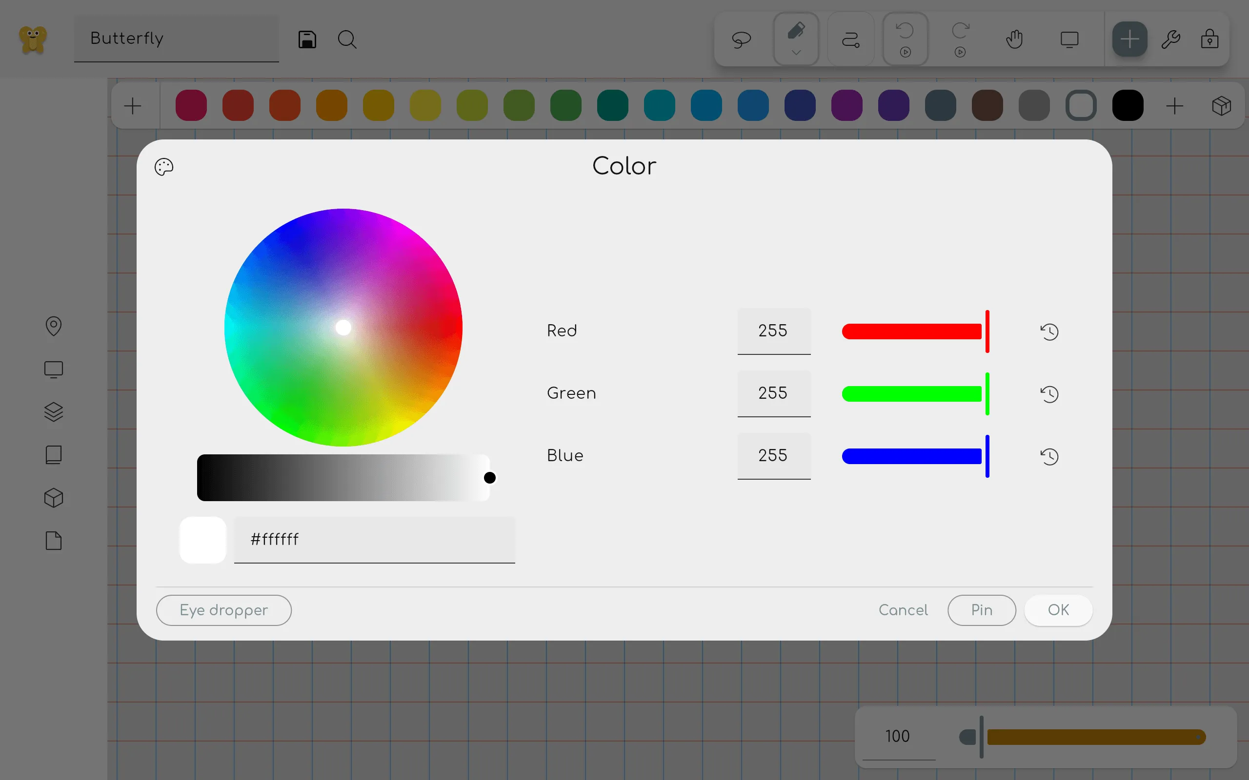
Here you can select any color you want. On the left you can see a color wheel. Under it you can select the brightness of the color. Note: if you choose a darker color on the bottom, the wheel selection gets less precise.
Under the brightness slider you can see a preview of the selected color. You can also enter a hex
code to select a color. It is specified as #RRGGBB, where RR is the red value, GG is the green
value, and BB is the blue value in hexadecimal notation.
On the right you can see the red, green and blue values that make up the color. These values can be changed by dragging the sliders or by entering a value between 0 and 255. Pin the color to add it to the color palette.
You can use the buttons above to toggle between RGB, HSV, and HSL views.
Clicking the Eye dropper button adds the Eye dropper tool as a temporary tool.